deMagdo new labels
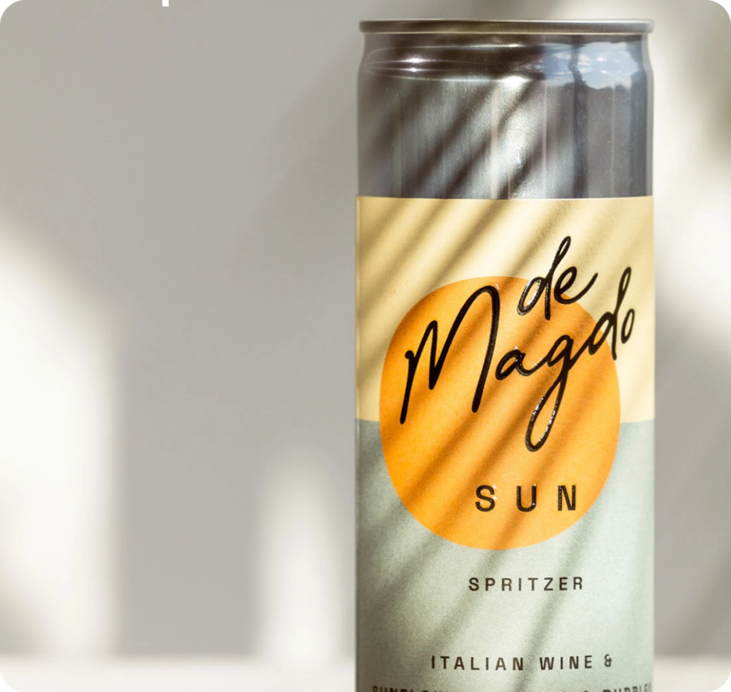
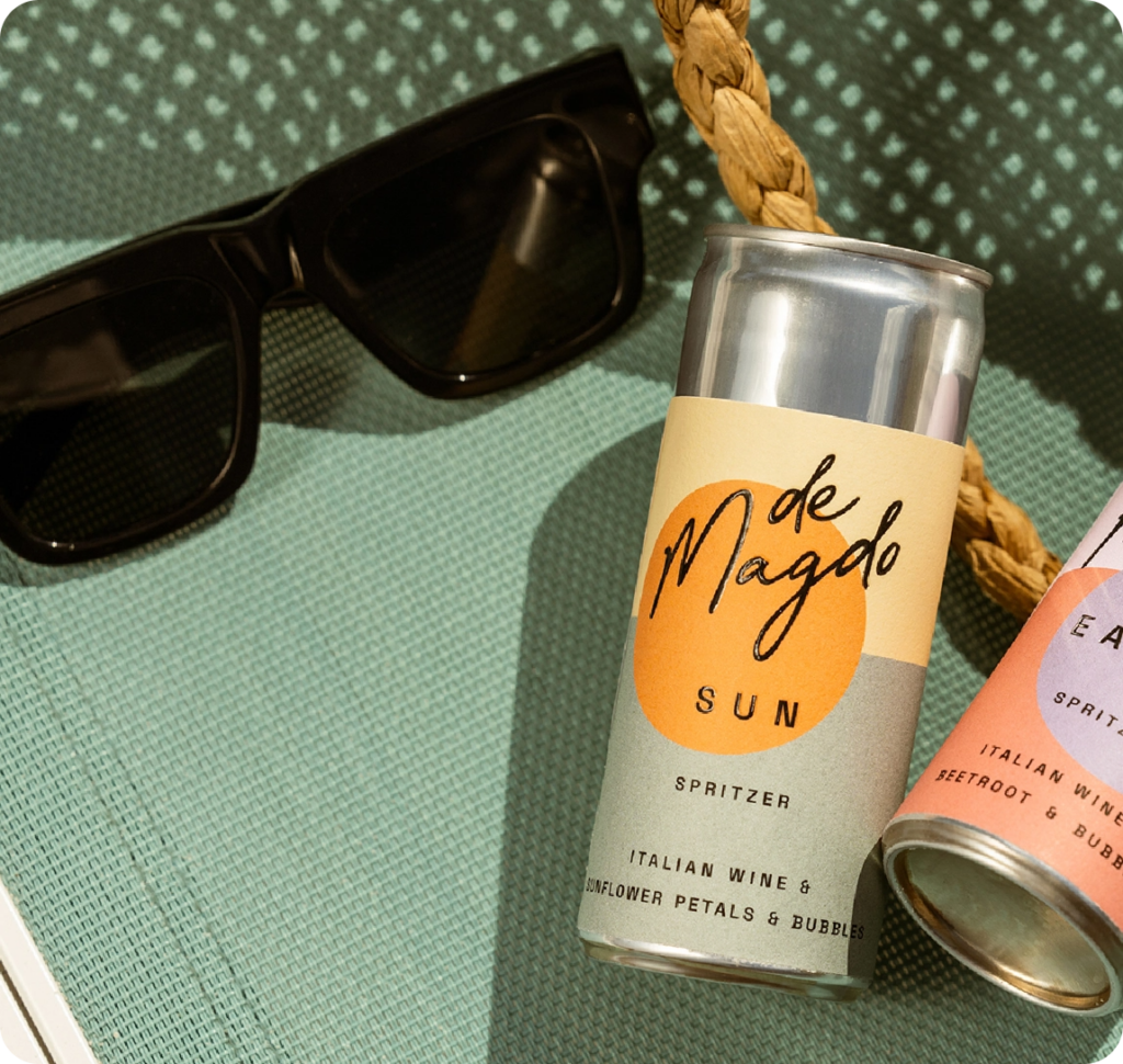
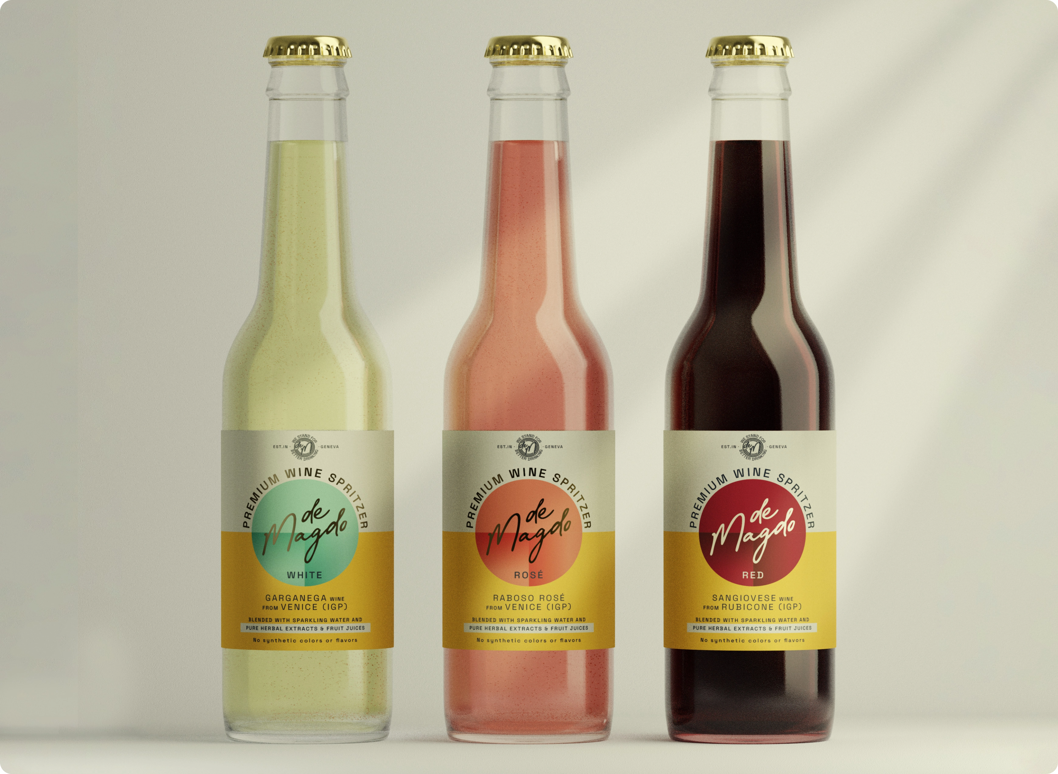
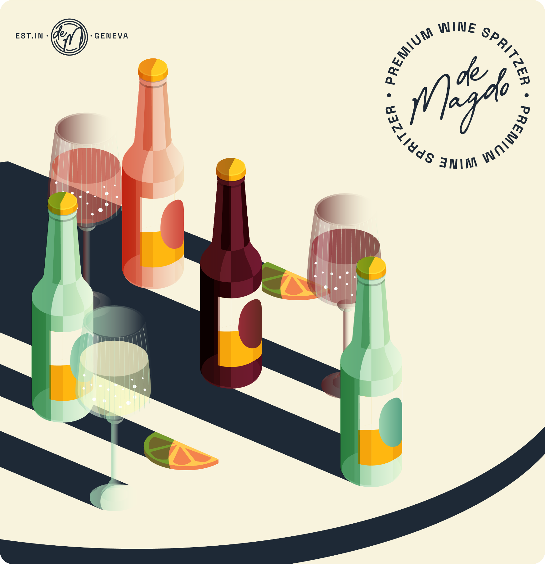
We are thrilled to showcase the collaboration with our long-time Swiss client, deMagdo, on the design of their new label for an exciting product line set to hit the market soon. This venture encompasses three exquisite offerings: white wine, red wine, and rosé. Our design approach focuses on clean typography and a harmonious blend of colors, ensuring a visually compelling and cohesive brand presentation.
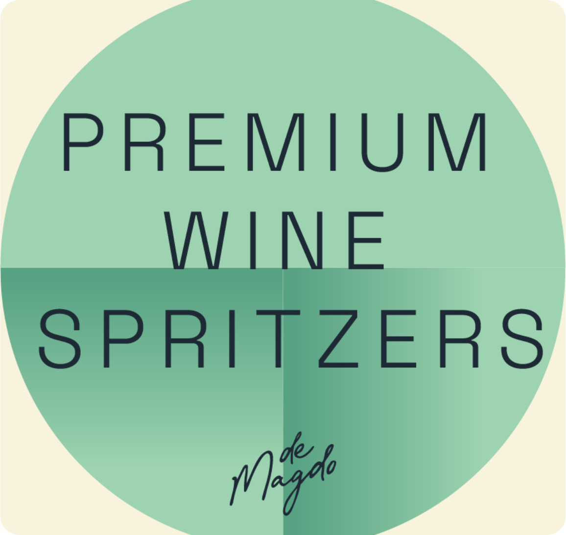
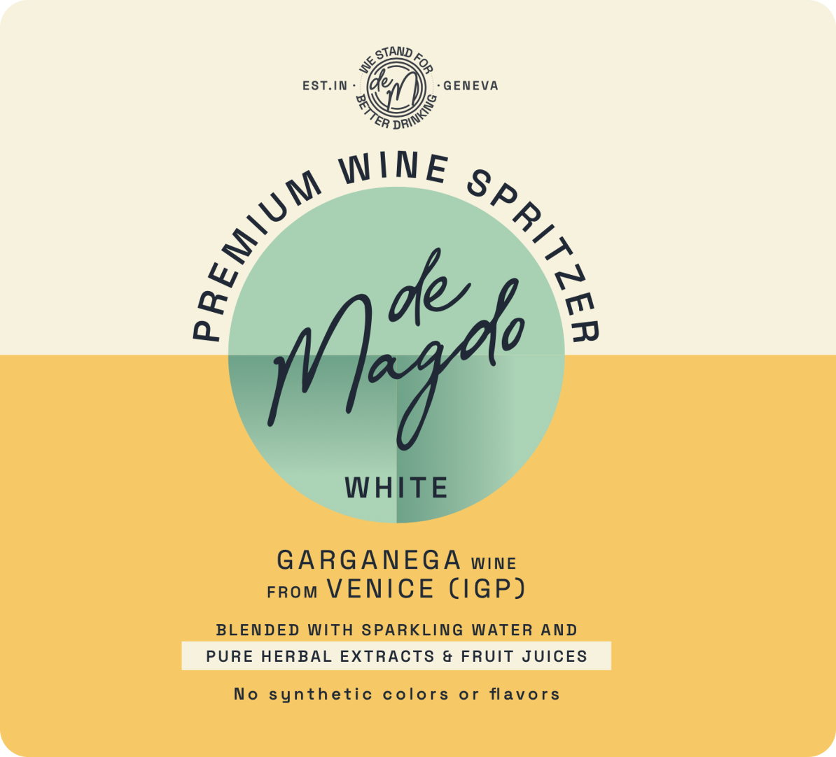
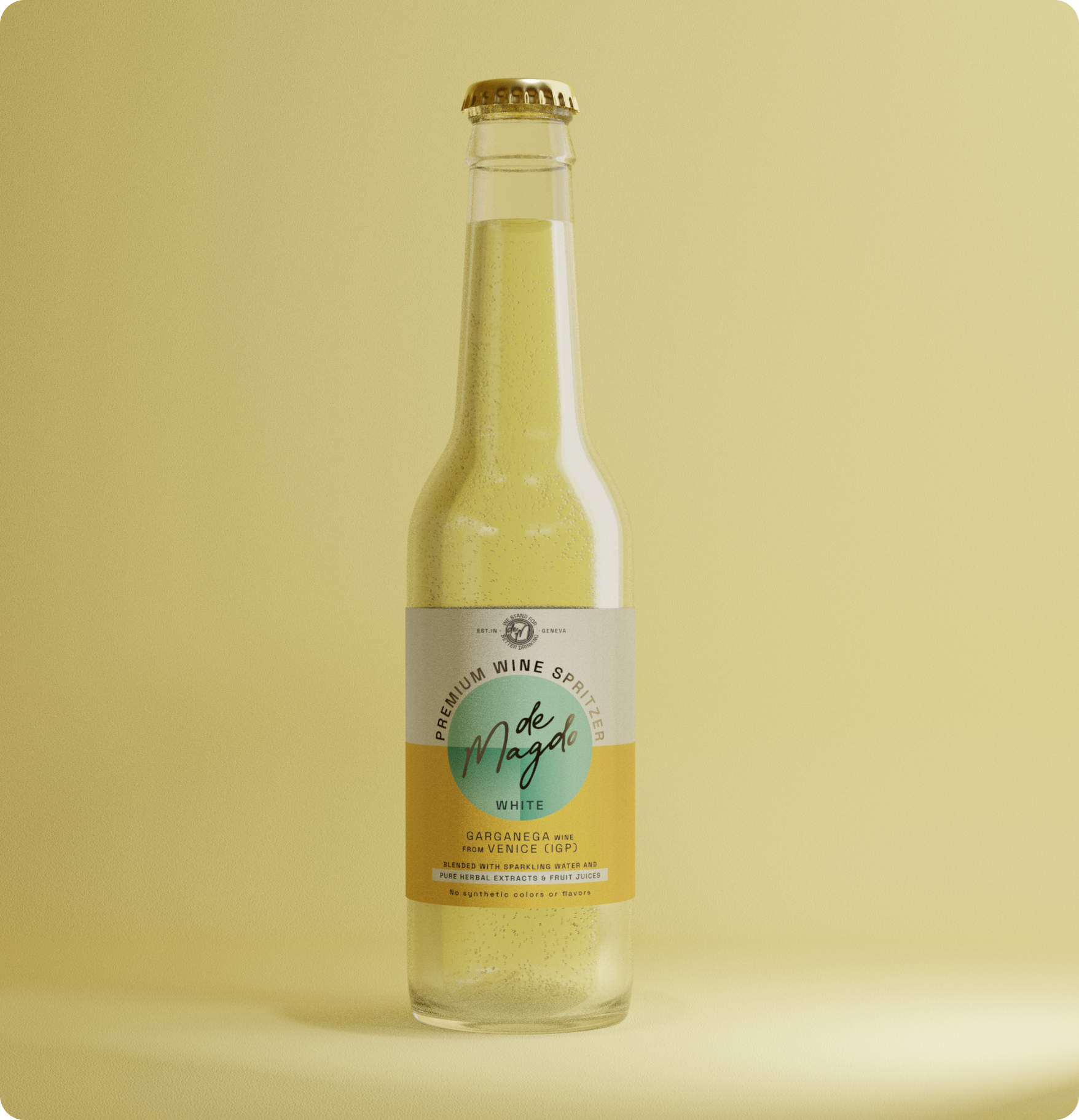
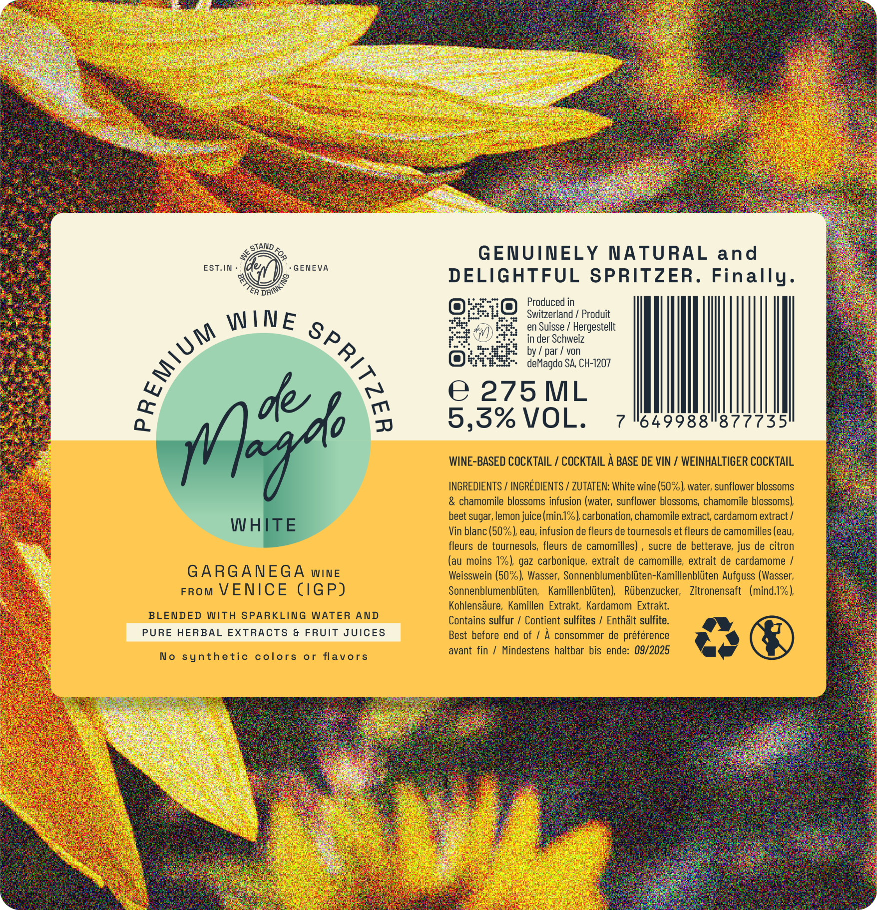
The label for the white wine boasts a refreshing aesthetic with a light teal color as its focal point. The clean typography enhances legibility, creating an elegant and modern appearance.
The addition of deMagdo’s original yellow shades from their brand identity provides a subtle but recognizable link to the established brand, instilling a sense of familiarity.
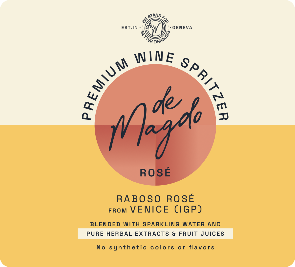
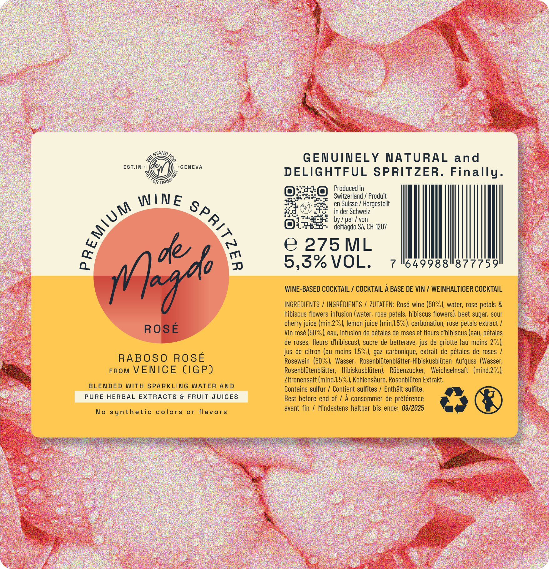
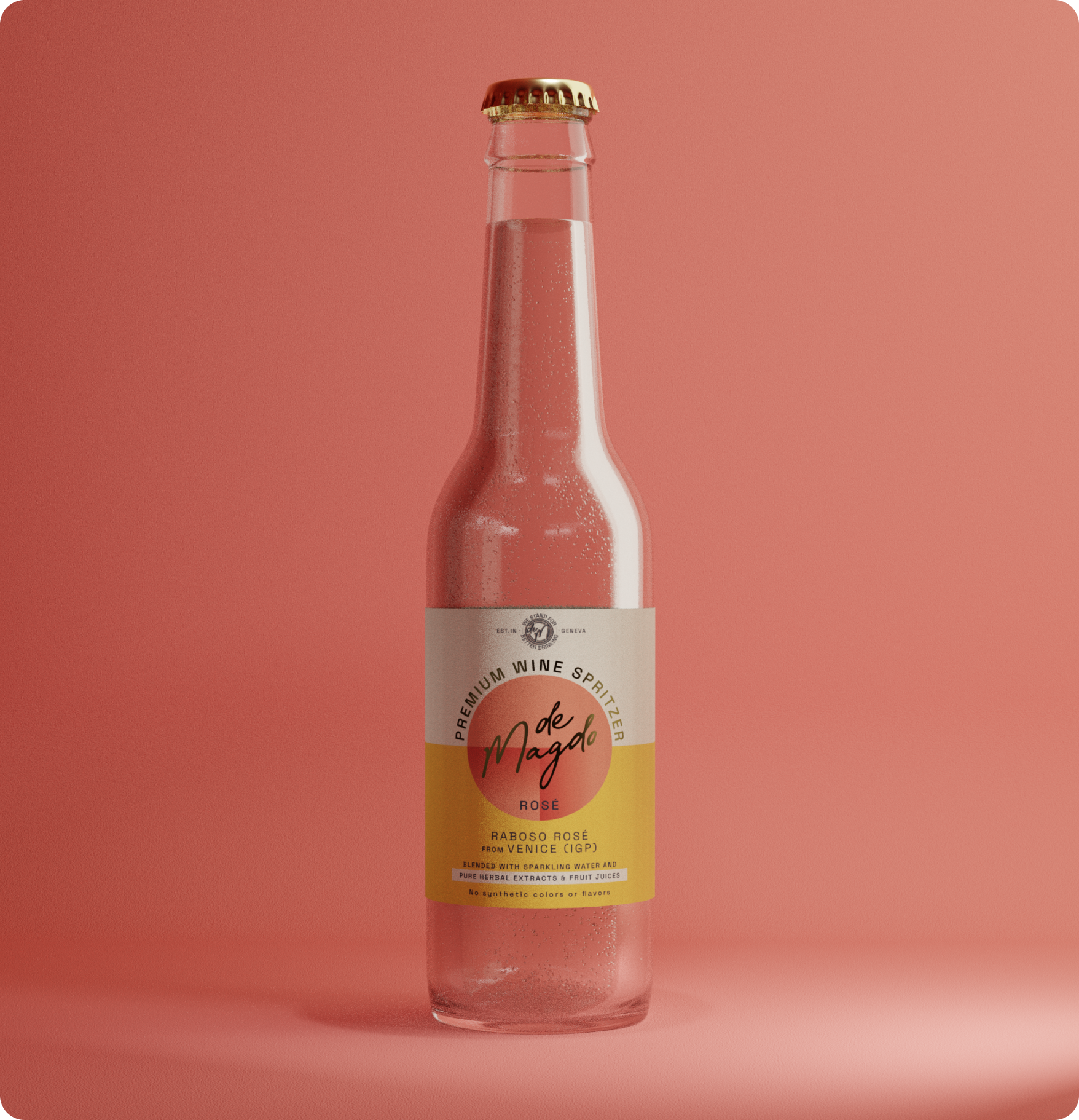
The rosé label exudes a delicate warmth with a light warm rose color. The clean typography maintains a sense of simplicity, allowing the soft color palette to shine. Integrating deMagdo’s original yellow shades adds a touch of vibrancy, creating a label that is not only visually appealing but also distinctly aligned with the brand’s identity.
The rosé label exudes a delicate warmth with a light warm rose color. The clean typography maintains a sense of simplicity, allowing the soft color palette to shine. Integrating deMagdo’s original yellow shades adds a touch of vibrancy, creating a label that is not only visually appealing but also distinctly aligned with the brand’s identity.
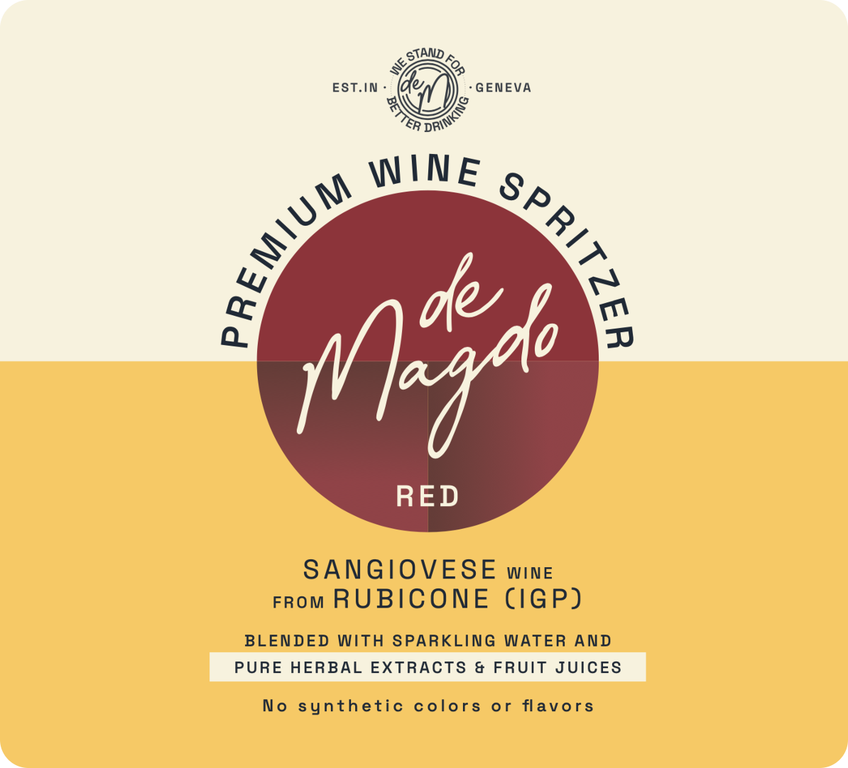
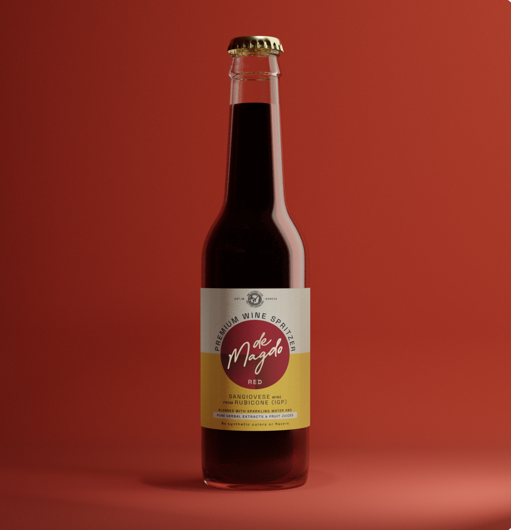
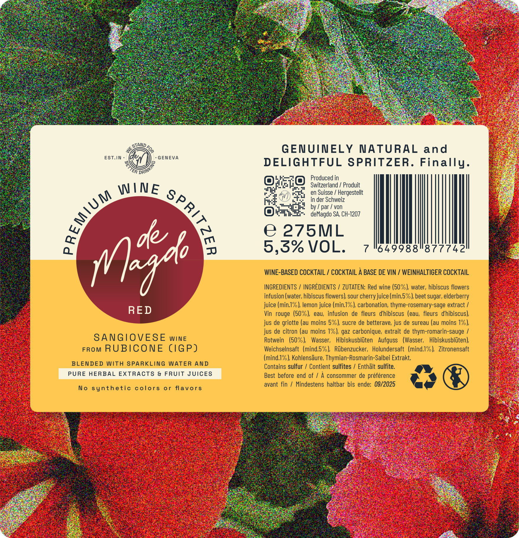
For the red wine label, a rich and sophisticated dark ruby color takes center stage. The clean typography is carefully chosen to convey a timeless and premium feel. This label captures the essence of the red wine within a design that is both contemporary and rooted in the established brand’s visual language.
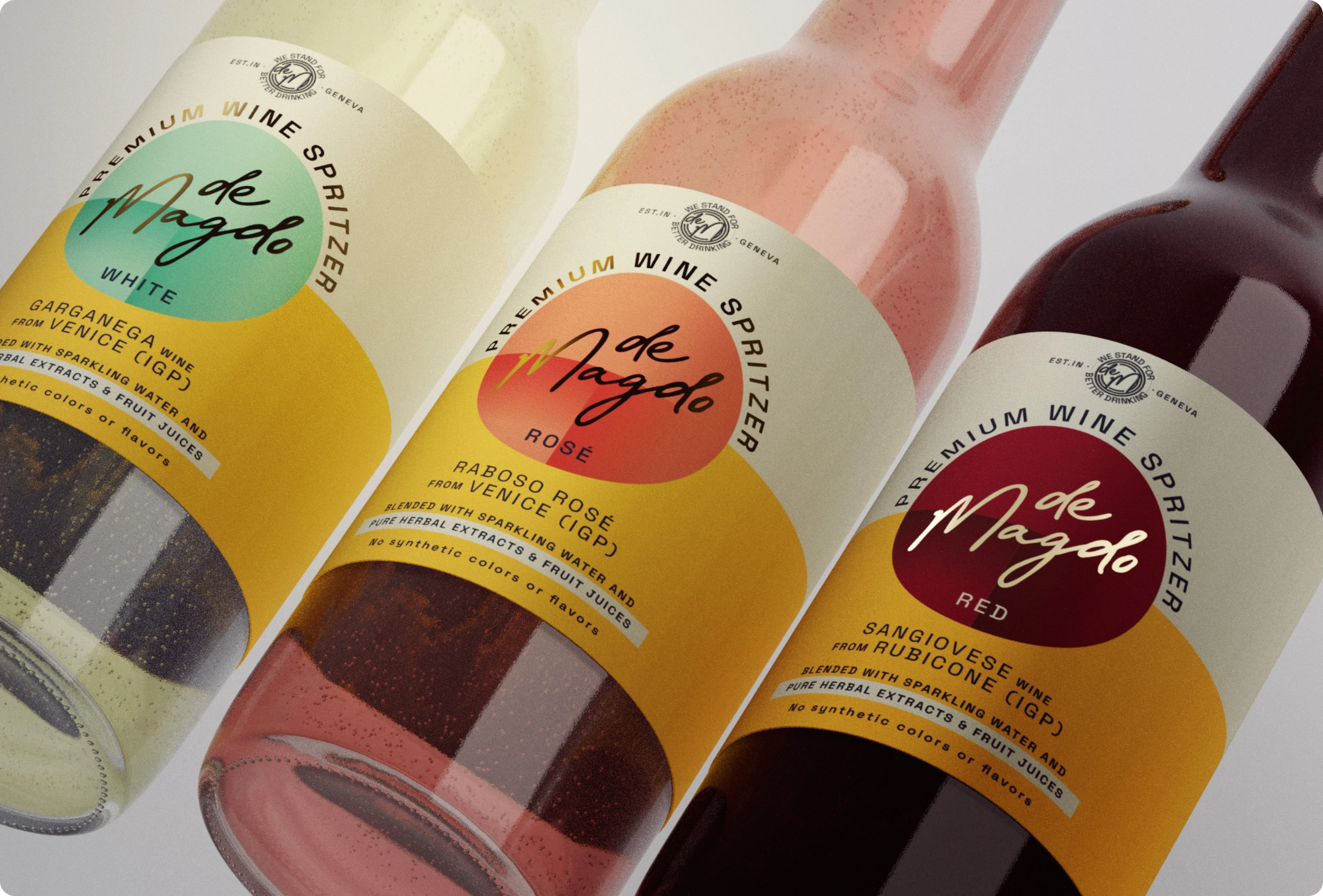
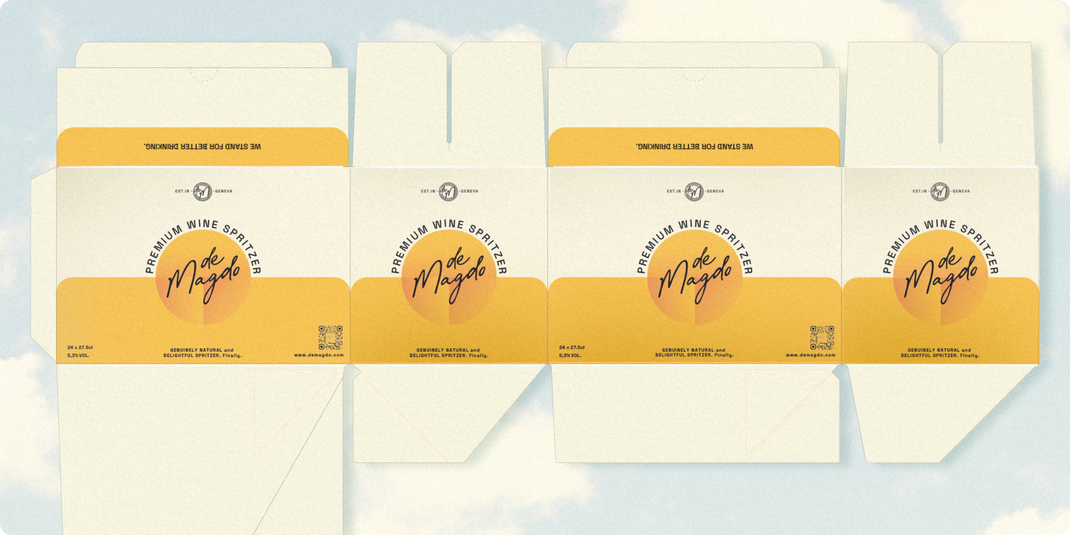
To accommodate various preferences and occasions, the label design seamlessly translates across both can and bottle versions. Whether it’s the sleek and modern can or the classic and timeless bottle, the design remains consistent, ensuring brand coherence across different packaging formats.
This label design for deMagdo’s new products represents a fusion of modernity and brand heritage. It’s a testament to our commitment to creating visually striking, cohesive, and versatile designs that resonate with consumers.

deMagdo
deMagdo is a story of three people who came together after being almost life-long friends. These friends, originally from the banking and investment industry, laid the foundation stone to an extraordinary brand of wine drinks originating right in Switzerland.
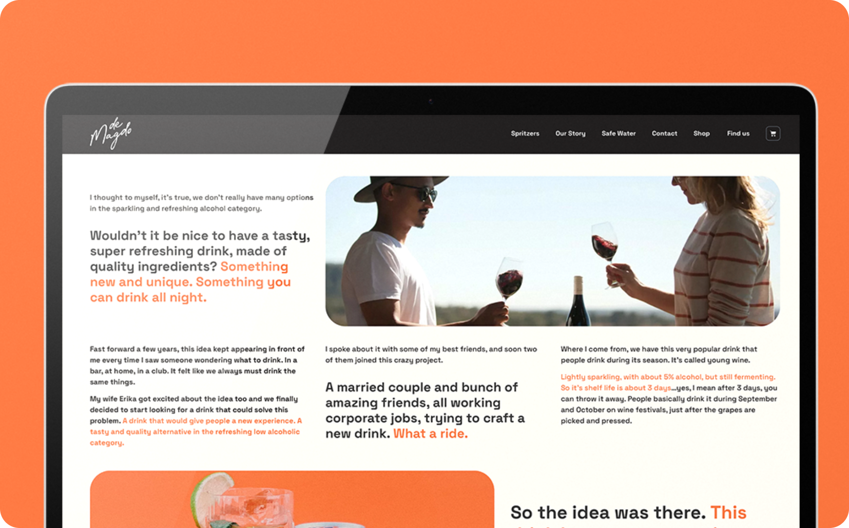
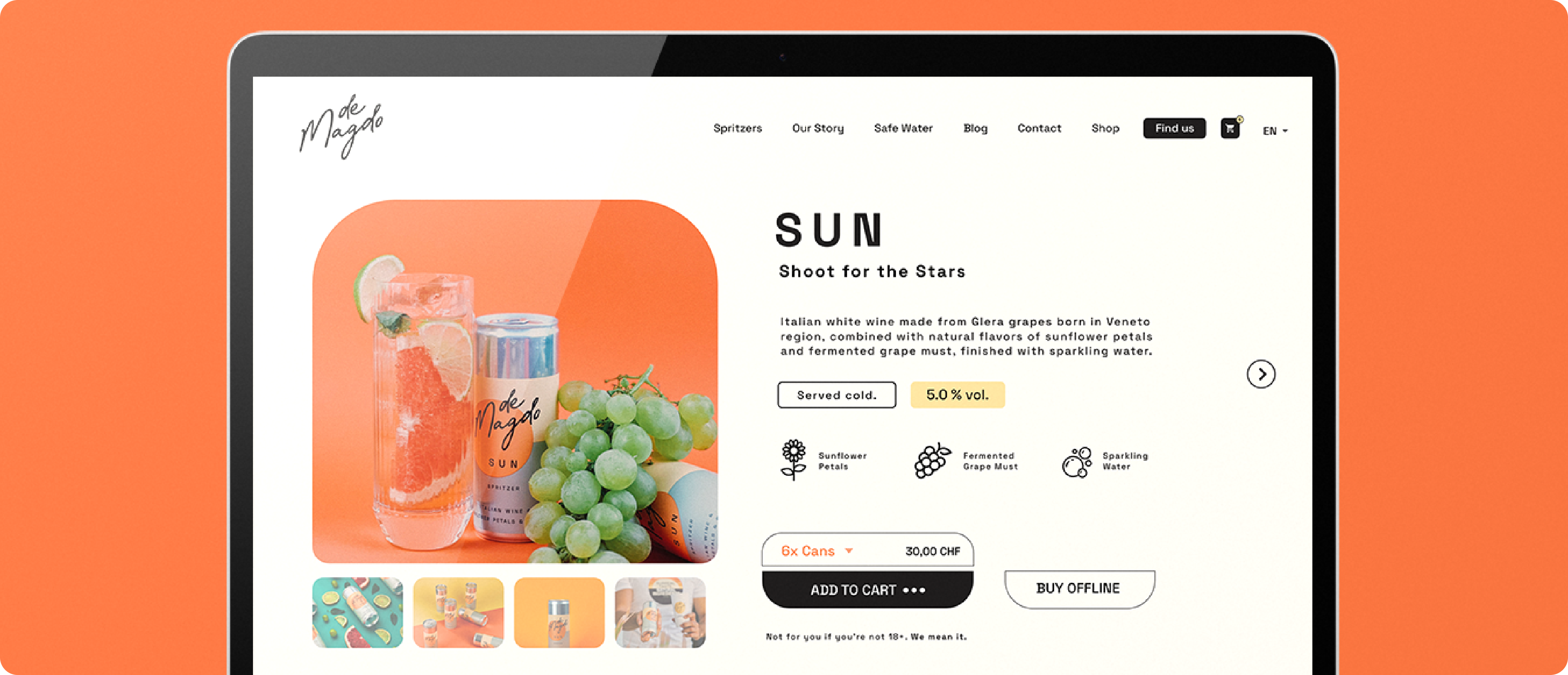
The deMagdo project is one the best examples of how we can adapt to the realities of different markets around the world. deMagdo started its journey in Geneva, Switzerland, which, as a country, has really high standards for literally everything. That's also why we always have to be one step ahead of any trends.
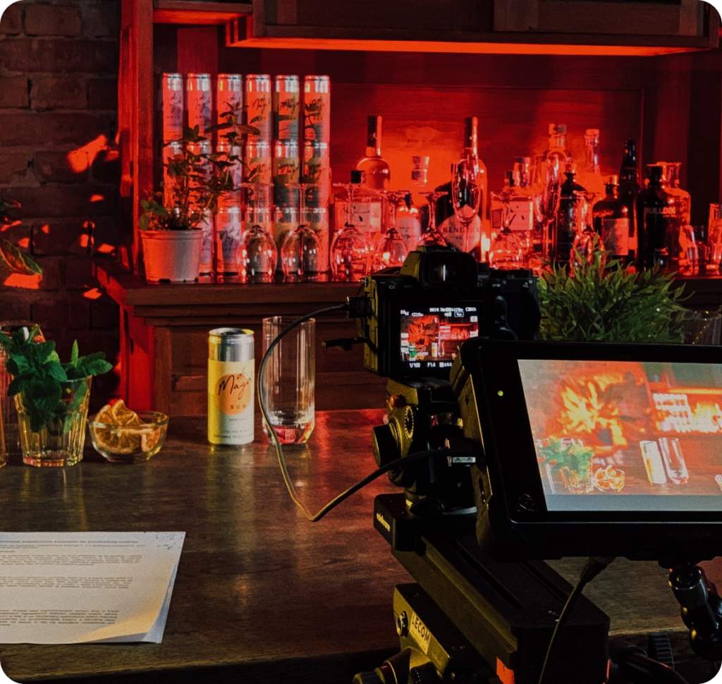
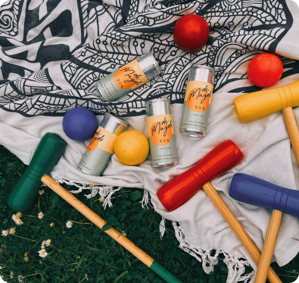
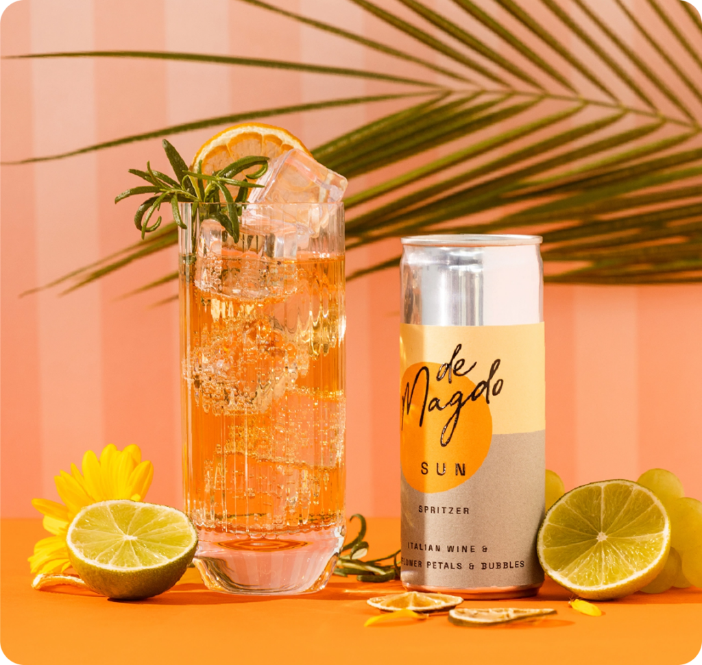
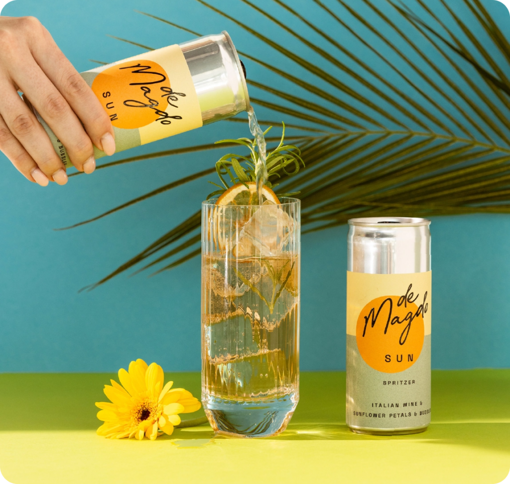
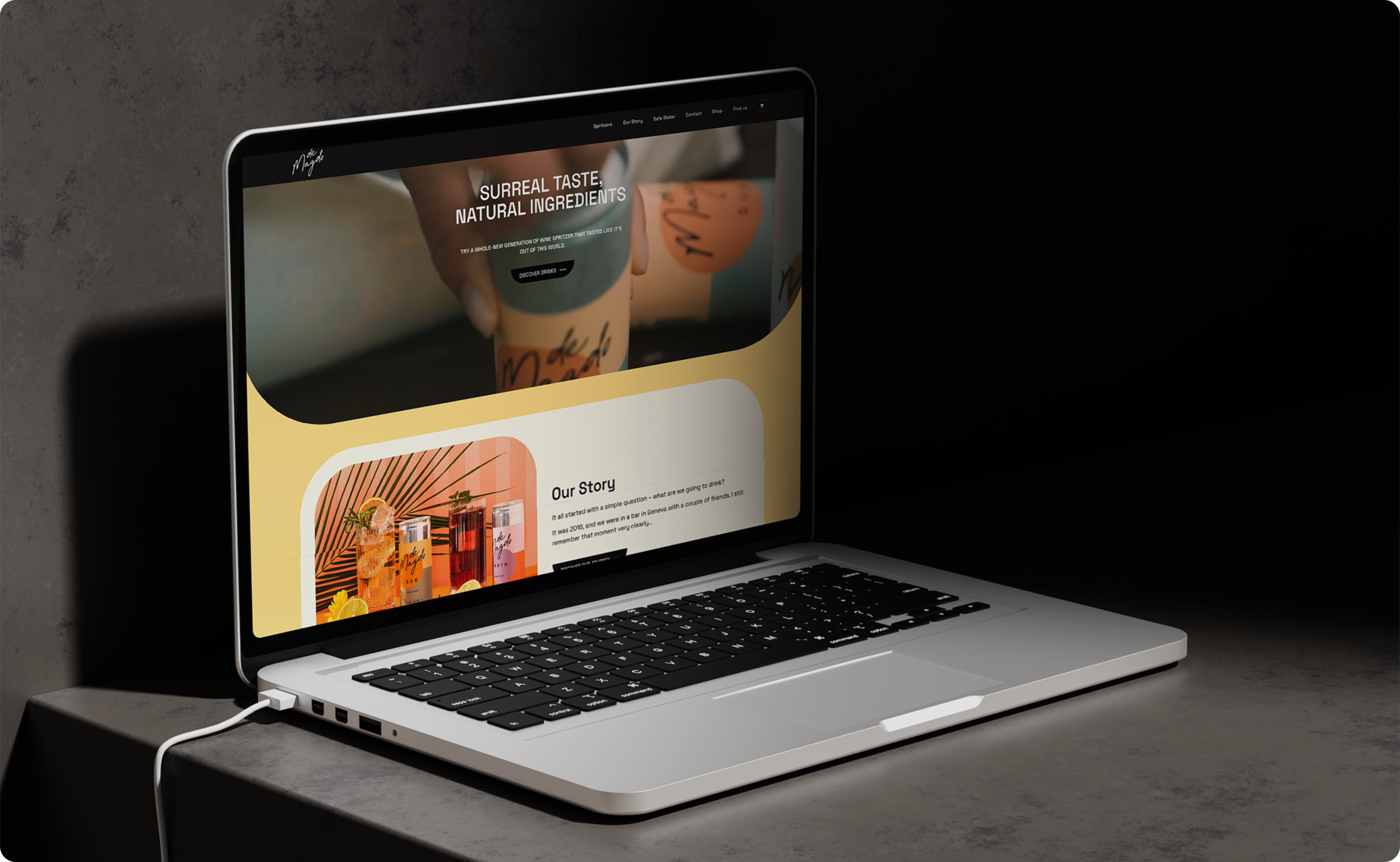
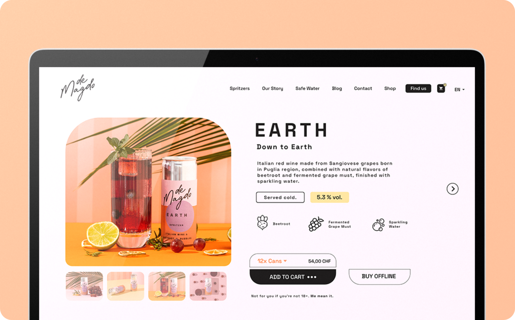
For deMagdo, we are a comprehensive communication partner for online and offline, communication as such, campaigns, social media as well as photo and video production. We also took care of the design and coding of their online store and the presentational website.
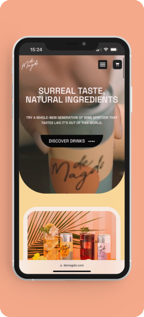
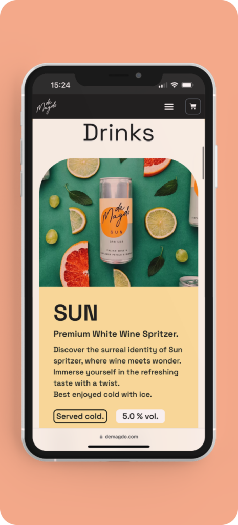
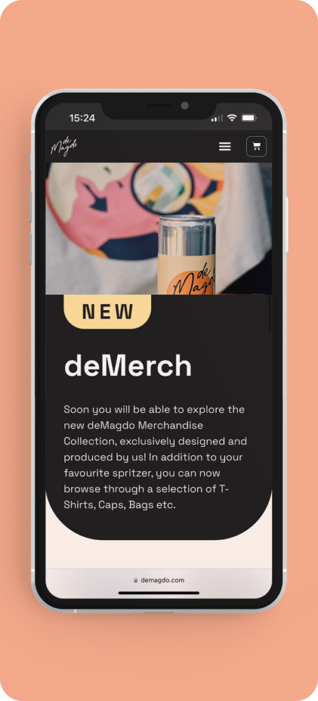


Web Design on Mobile Version – Colorful, Dynamic and User-Friendly. We have also incorporated and designed the e-shop for customers which is simple, easy to use and well-functioning for the product.
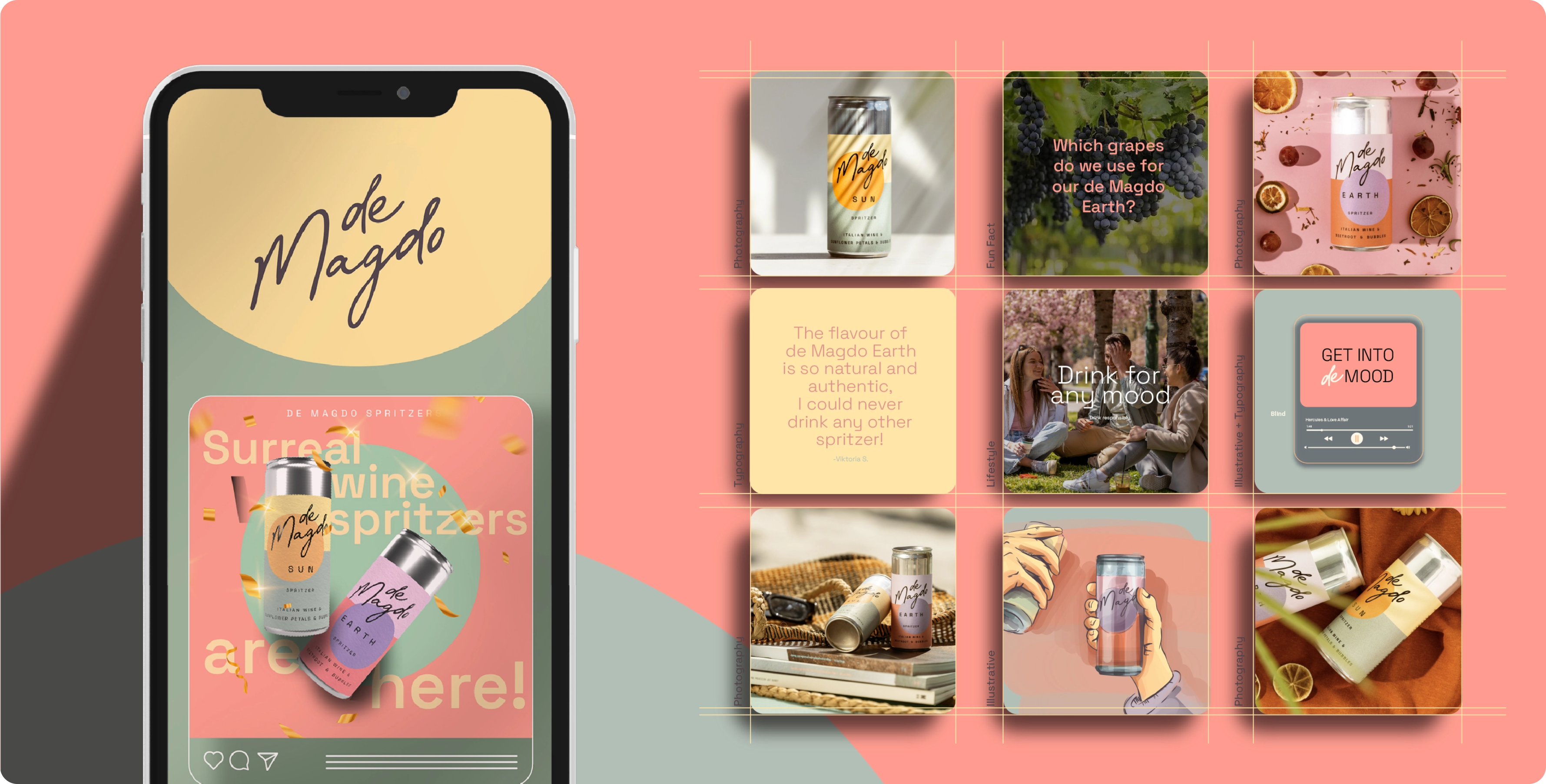
Social Media Communication

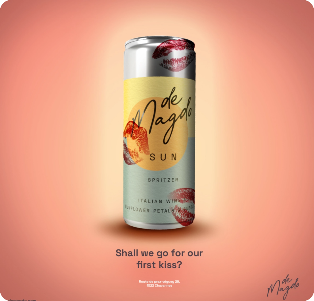

Illustrations/Merch & Printed Media
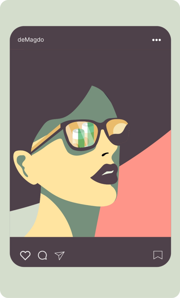


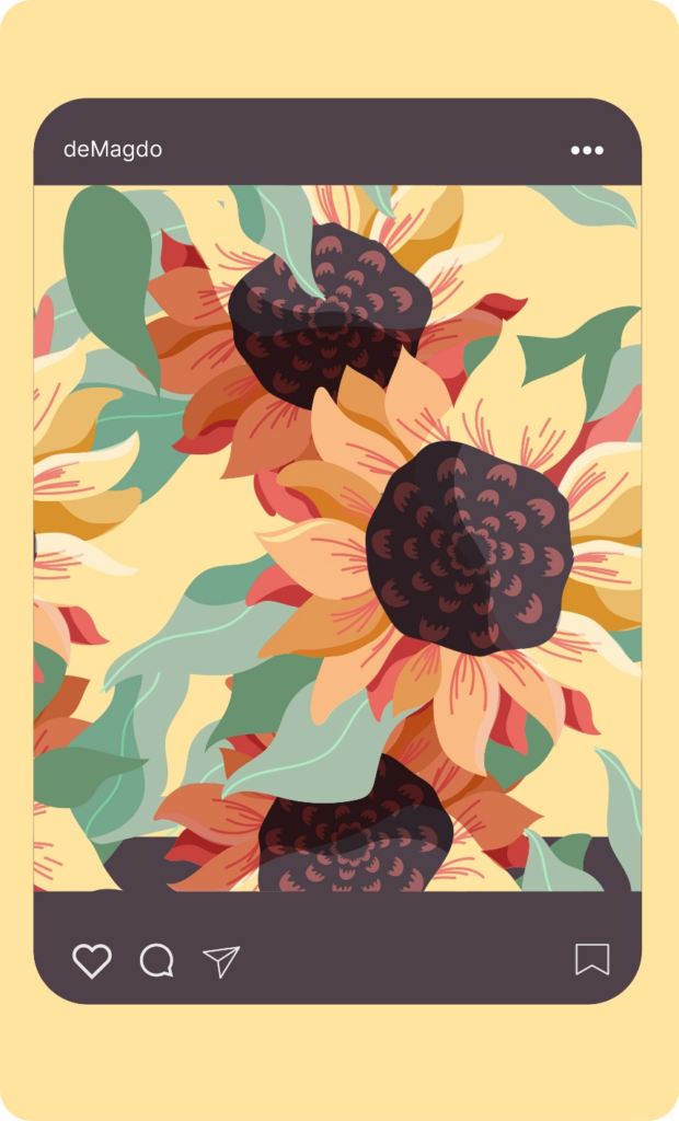
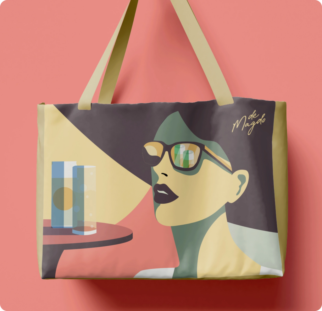

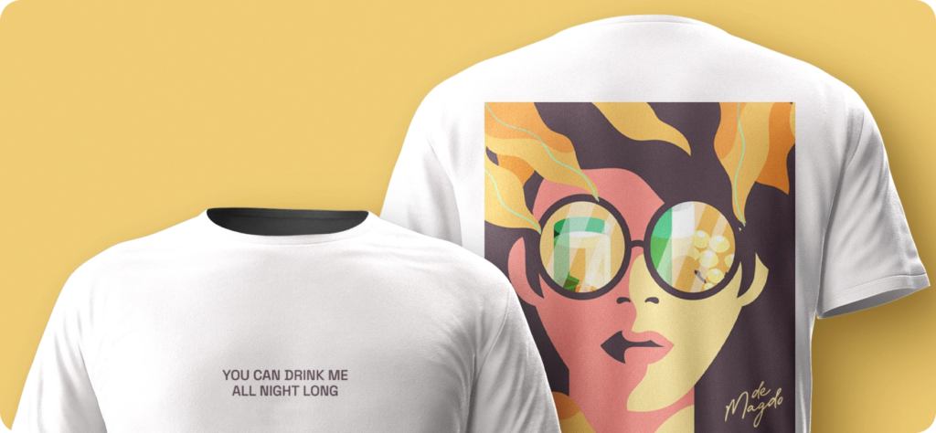
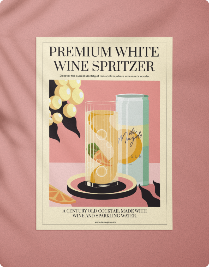
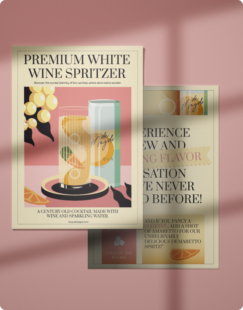
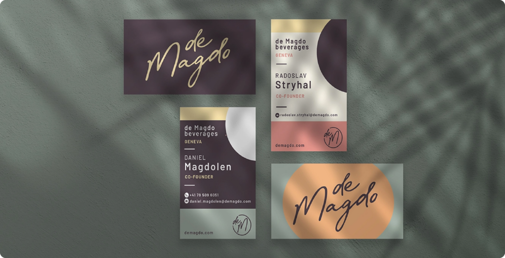


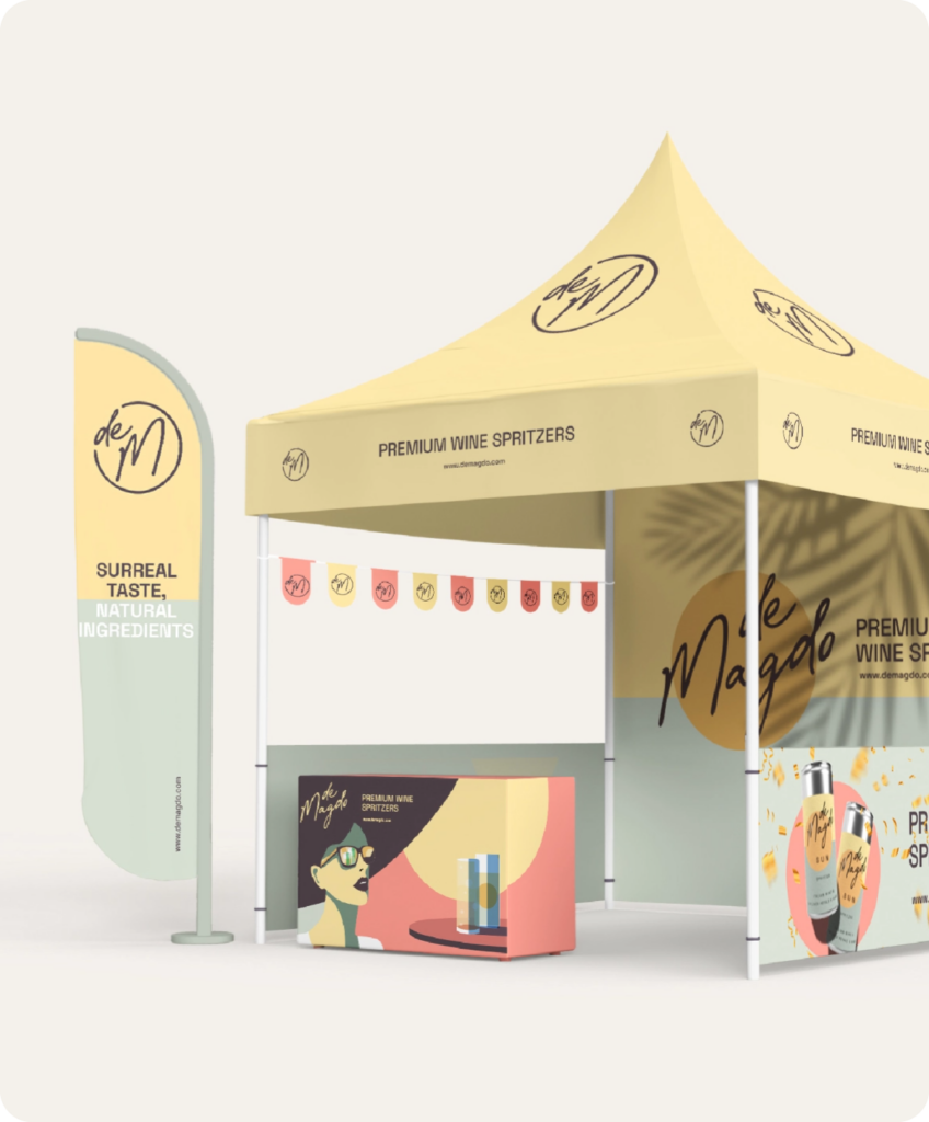
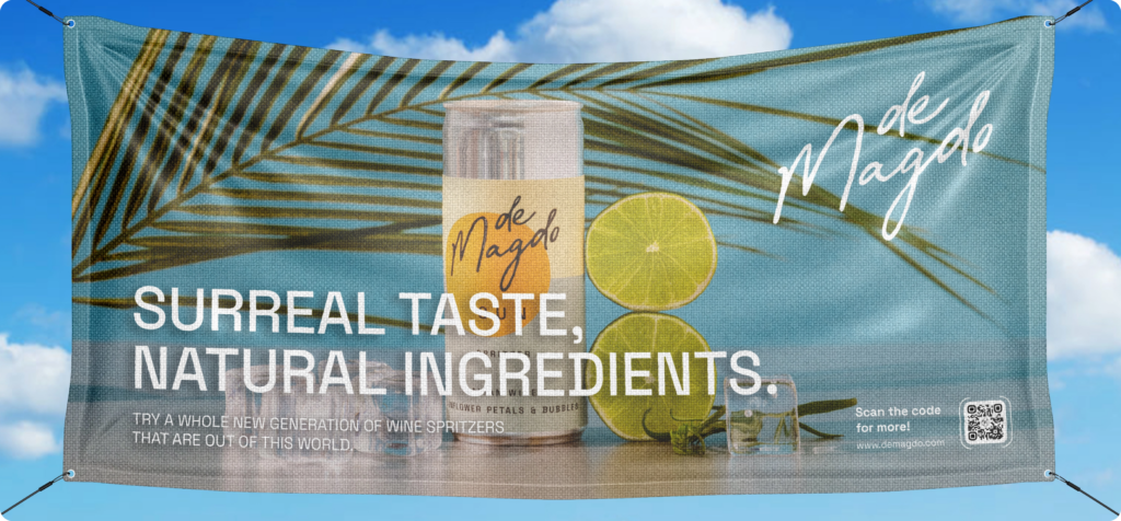


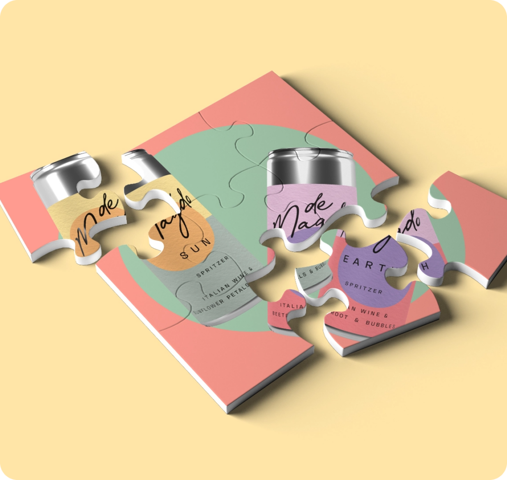
Photo Productions

